“Design can be art. Design can be aesthetics. Design is so simple, that’s why it is so complicated.” – Paul Rand
There’s more than meets the eye when it comes to a finalized product packaging design today. From structural concerns, to the visual, aesthetical presentation that catches people’s attention, packaging design is faced with a highly challenging decision.
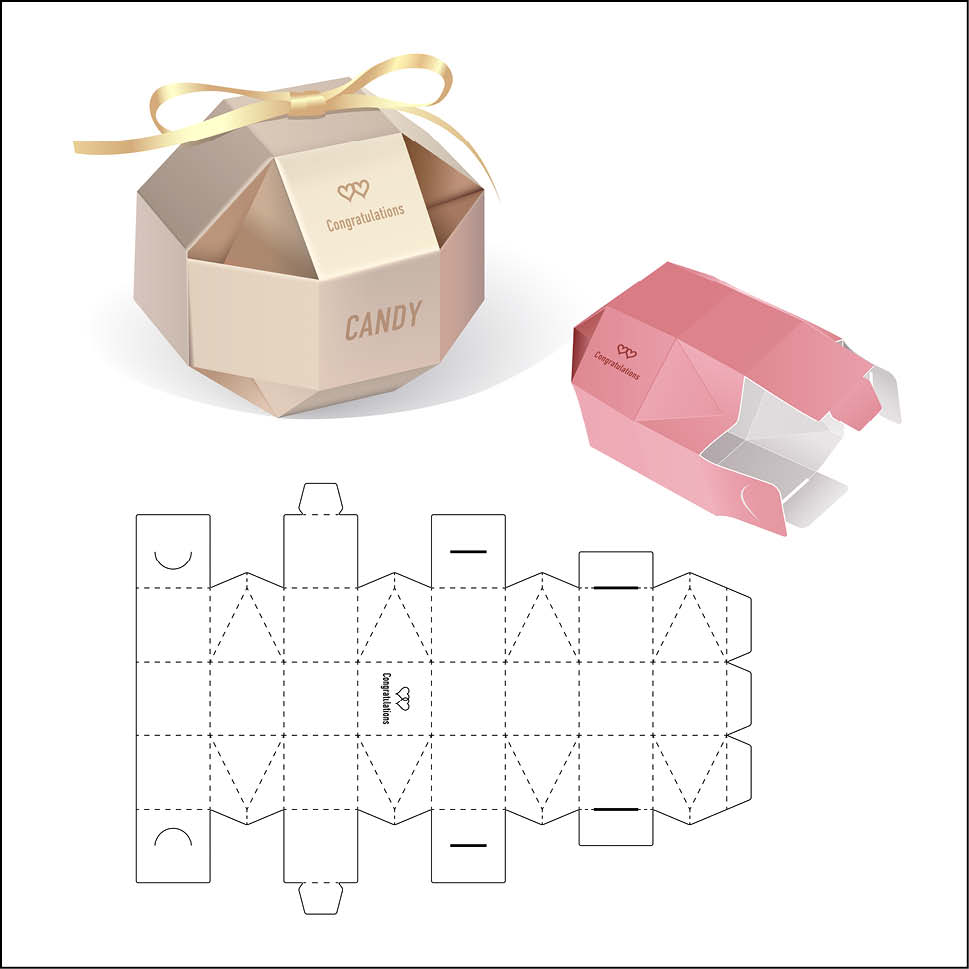
In the formation of visually appealing and dynamic packaging, the designers need to be concerned with combining both visual and structural design to display the product in the perfect, most accurate light possible. The structural design, which is concerned with maximum functionality, will need to marry the visual design, which ensures that the product is ultimately, eye-catching.
It’s two very different sides of one coin, which is why product packaging designers need to be sophisticated, imaginative, and pragmatic people today. Striking this balance can prove difficult.
So how can you ensure that your product’s packaging is sitting at a critical intersection of both visual and structural success?
Don’t Trade in Functionality
Let’s look at the first important mindset when approaching both of these schools of thought. Although the appearance of the package is what’s most memorable, the functionality should receive more of your attention.
At its essence, a functional package can reduce waste, which is something that appeals to conscious consumers today. Functional packaging can help the planet, save you time and money spent on unneeded materials, and communicate your design that much more quickly.
When designing the functionality of your product, make sure it’s versatile. Work to source 100% recyclable material, or material that can double as a plate for the food packaged. If you can think up something that is a two-in-one deal, consumers will both appreciate your cleverness, as well as your investment in the health and sustainability of the planet.
"Less is More"
On the note of functionality, never forget that less is more. Minimalism should be a core of your structural design, helping you to remove unnecessary materials and designs that may actually confuse your consumer. House different parts of your product in a minimalist, organized way that will impress your consumers while also making the product look that much more ‘cool.’

Sprinkle in the Pizzazz


Now that you have the structure decided and approved, it’s time to optimize the functionality of your packaging with some fun design. How can you combine the two in a way that won’t detract from the functionality?
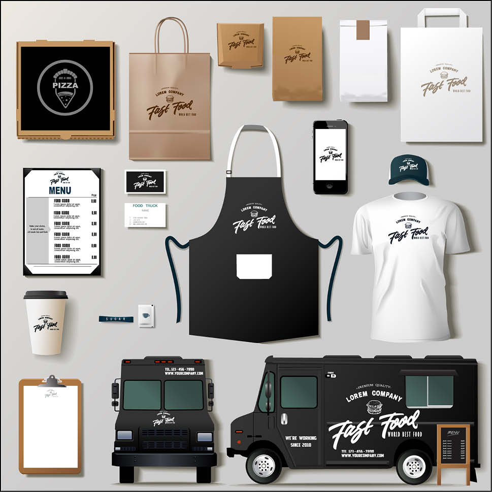
- Brand colors: Be sure to always maintain a consistent branding in all of your packaging. Use your same brand colors/logo colors in your packaging so that you start to create an association in consumers’ brains.
- Coating/ink: Find a coating or ink that aligns with your brand standards. Use it on all of your packaging. This can include embossing or debossing to give your packaging design a unique texture.
- Unique shapes: Have fun and experiment with unique shapes, like a trapezoid that has two edges curved. Don’t be afraid to get edgy.
- Graphics: Lastly, use graphics where applicable, although be careful not to over-use them and create a “busy” image.
Different Goals for Different Products
It’s important to always remember that the structural and design requirements of your product will vary depending upon your industry, product, etc. Whether you’re doing food packaging or point of sale displays, you are going to need to account for these different requirements each time.
Here are a few tips to help you balance the two despite the industry changes:
1. Point of Sale:
It goes without saying that point of sale products need to appeal directly to the consumer. Since most of these products end up in retail stores, you need these products to literally “pop off” the shelves at consumers. They are going to be stacked up there with dozens of other similar products, which is why your product needs to create a connection with the consumer.
How? Consider case bins, end caps, shelf-takers, counter displays, and lenticular walk-by-signage. Don’t be afraid to think big with this kind of presentation.
2. Food Packaging:
Everyone around the world indulges in food, multiple times per day, hoping to take their favorite treat home in packaging that caught their eye at the store. Of course, there are millions of food companies, all vying for the same consumer appreciation as you.
It can be hard to make food products that stand out from the competition. You’re probably using the same ingredients as the next competitor. What can make it happen for you? The packaging. With the right structure, colors, and messaging, you can convince consumers to choose your product on their grocery shelf.
3. Distilled Spirits Packaging:
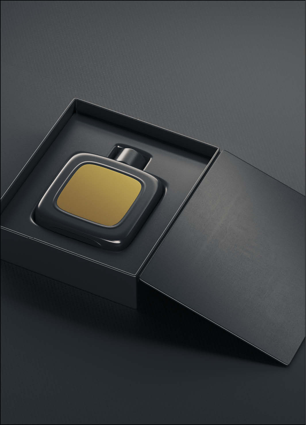
Distilled spirits packaging is your chance at communicating the experience consumers can anticipate when using your product. Since spirits are often designed to impress, make sure that the structure does the same. Sturdy, invested cardboard or other materials will communicate a luxury appearance that is in-line with the spirits brand. Be sure to test it out and guarantee that the packaging can support the product.
Finally, add finishing touches that align with your brand. For example, a tequila product should have an agave plant somewhere on the labeling.
4. Sales Kits:
Since these products are used in presentations and meetings, sales kits need to immediately tell consumers what you have to offer. Try and include separate compartments to emphasize the value of each element within the kit. Be sure to stick to your brand colors and utilize a polished design that gives off that ‘wow’ factor.
5. Beauty/Personal Care:
You’re going up against thousands of competitors in the beauty and personal care space. As products that are more about aesthetics in the first place, like lotions for wrinkles, etc., consumers expect a design that really entices them. At the same time, you want to convey the genuine benefits of the product, right on the front of the packaging, will balancing colors and minimalist structuring that makes the product look ‘clean.’

Which is More Important: Structure or Design?
Overall, both structure and design are equally important in the entire product packaging process. What’s the point of a gorgeous package if the product falls through it? Starting with the structure, and then finishing off with the design, will help you arrive at the best product appearance.
Here at Lize Packaging Singapore, we do just that. Feel free to work with our packaging experts today.
Related Posts
August 18, 2019
Is Your Product Packaging Resonating with Millennials?
As of this year, millennials surpassed…
May 22, 2019
Greener Consumer Trends – Why Companies Need to Adapt Ecofriendly Products & Packaging
Just as Steve Jobs so aptly said before…

